Sunday, 15 May 2011

8x8 Project

My current project 8x8 is a publication which will bring together eight short stories by creative writing students from Manchester Metropolitan University and design talent from Stockport College.

The book is being published and will feature at Didsbury Arts Festival, which is a high profile national event. 

Each person in my class has been allocated a story to illustrate, but with there being only eight stories and a lot more students this meant we were competing against each other to win the chance of having our work published. We had to present our ideas to our tutor and the guy from Man Met and then the decision was to be made about who would get the job!

I was very nervous while we were waiting for the decision as i was under prepared due to being poorly for 2 weeks and had also missed the briefing, so I felt behind. I was overwhelmed to find out that my idea had been chosen and my work will be published in the book!! I really am very happy!! 

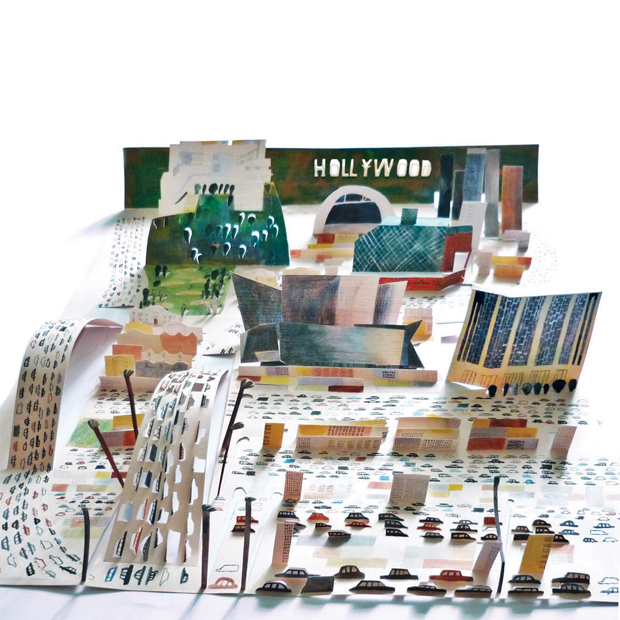
I am sticking with my method of cutting shapes, suspending them and then photographing the outcome. I started this process, took lots of shots and unfortunately lost my work..terrible!!!
But I have a week until deadline so I am back in the studio tomorrow morning to set up again and re-take my images! This is a good opportunity not to be missed!! Luckily with the way I work I have all my elements cut out and they are physical pieces so I can easily set it all up again and photograph, and it gives me the opportunity to improve anything that i wasn't happy with before!

The story I have been allocated is entitled 'Shine in Your Corner' by Jennifer Guilliard. It's a story set in Africa portraying some of the struggles that people face on a day to day basis. It describes the red dust of the earth and the people rejoicing, but also their struggles, I am trying to combine all of this into 2 images.

My inspiration for this project has mainly been African flags! Some are absolutely gorgeous with such lovely shapes. Quite naive and colourful, almost childlike. I love them! 


I borrowed a book from the library showing a variety of African flags of the Fante, they are just delightful!! Lovely stitching and shapes! I want this naivety in my work. I want a feel of the African spirit, to represent a sense of place but still sensitive to the story while showing the peoples courage at the same time.

I will update with my shots once they are taken, and my final will be up very very soon! 


Wednesday, 11 May 2011

1 2 3

I have been given a lot of advice in my lifetime, but when asked to think of the best 3 pieces quite a few popped up in my mind! Obviously relevant to my studies and my future within illustration, not just general life!!


Here goes...

1) SET UP A WEBSITE!..if people can not find you they do not know you exist!! When contacting Art Directors send hand made packs as it is more personal and they are more likely to look at it rather than an email. Choose carefully who you send your work to, make sure your style is relevant otherwise it is a waste of your time. 
Also, do not give up!

Garry Parsons gave this advice when I attended a Business Master Class in London run by AOI.


2) Enter as many competitions as possible when you are an aspiring illustrator to get your name out there. And never change your style to suit anyone else. 

Olaf Hajek gave me this piece of advice when I visited his studio in Berlin, and it's true you should not be what you think people want you to be or do work you think people want to see, in a fashion they prefer (i.e. digital work)!! but you should just do what feels right for you and keep your own style. Olaf is a very talented painter and he said he will not change what he does to suit other people. I think it's fantastic he has retained traditional methods and he is highly successful.


3) Making mistakes is just as important as doing it right!

My tutor Joanna Nelson gave me this piece of advice today and it is so true, you have to make mistakes to move forward with your work. Be daring and try things, if they work great, if they don't then at least you learn!

I wish I'd done this!!


If there was one piece of work that I wish was mine, it would be the stunning installation that I have posted above by Kirsten Hassenfeld. It is entitled "Dans La Lune" which roughly translates into "daydream" or "daydreaming" in French. I think the title is very appropriate.

  Hassenfeld has an obsession with paper which I can relate to, however she pushes boundaries and her work really is quite exquisite. It's amazing how someone can create something so beautiful out of just paper and a few bits of tape and glue to hold it together. Her designs are elegant and dramatic, and her use of lighting just enhances how spectacular they really are. Hassenfeld can make paper take on different forms, she can make it appear shiny like china, she turns paper into shapes that suggest everything from cut glass to natural rock crystals. Her installations are so delicate and pretty, I would love to go and see her work, I imagine it has a really calming atmosphere about it almost dream-like. The lighting element creates a soft glow at the centre of each piece, making them appear lantern-like and dreamy.


Dans La Lune contains the biggest objects Hassenfeld has ever made. Structures four to eight feet in diameter hang like gigantic droplets. These huge droplets are embellished with beads, chains, gem-like crystals and a whole load of other surprises. I adore all these elements! It is just my taste!


 Above are a few close ups of Hassenfeld's installation, they are really quite extraordinary! It is hard to believe that anybody could create something so ornate out of paper, the most ordinary of materials. After looking closely it is easy to see how obsessively detailed the objects are, they reference luxury goods, classical architecture and decorative arts. I really wonder how long such a work of art takes to create, the detail amazes me. Even the pony in the picture above is made to look like lace, under the gazebo with the elegant lady. Hassenfeld clearly has a fascination with the beauty or adornment. These obsessively crafted objects create a world of decorative excess. It is almost like a 'wonderland', a place to escape to. It reminds me of fairy tales.

Hassenfeld has played around with scale which is something I would like to do in my own work in the future as my own style progresses. By lighting her installations they appear more dramatic and it creates a mood or a feeling.  


It is obvious to see that Hassenfeld is extremely talented in creating these painstaking installations. It obviously takes a lot of time, skill and patience to create such works. I chose to look at Kirsten Hassenfeld's work as I felt I could relate to it even though her stuff is at the other end of the spectrum to mine! I aspire to be as good one day! I am thinking of moving my own work forward and experimenting with such techniques, and I am considering this for my personal project that we will be doing in our final year of university. If i did chose to experiment with this method it would be on a much smaller scale and I'd have to try things out as I currently cut 2D shapes out of paper, which I then compose by suspending to create a 'scene', and then I photograph to get my outcome. Maybe moving towards 3D is the next step for me!   


Tuesday, 10 May 2011

Hello!

It seems like I have been away forever! Unfortunately I was poorly and my blog was neglected but all is well now!

As promised I have my final outcomes for 'James and the Giant Peach' brief and the 'Wellspring' brief too.


I hope you like!

Friday, 11 March 2011

Laura Carlin

I was flicking through some illustration books in the library today and came across some work by Laura Carlin. They are delightful pieces, very detailed and have a naivety about them.

The 3D paper cut works are relevant to the style I have recently adopted, although very different. 


I may consider this way of working because I love the effects, they look great! They are playful yet sophisticated.


Laura Carlin also draws a lot of images which are really quirky and unique.
I really like her work.


Friday, 4 March 2011

Wellspring project progress!

I spent most of yesterday in the photographic studio setting up my design for the back cover of the newspaper we are making.

I used a 'cove' with wooden dowels placed across the top to suspend my elements from. I fiddled with my piece for absolutely ages to get the right composition...good job I have patience!! Then I took photographs with sufficient lighting, here is the outcome! 


The requirements for this brief is that it has to be in black and white (newspaper), I think my design works well with this limitation; the type is legible and the detail I put into my design can be seen, adding interest.

I still have a little more type to add, as required, which will be computer generated type as a small contrast to the hand generated type that is already on the image. I also have two logos to consider.

I will upload the final back cover once I have added the above!


Thursday, 3 March 2011

The Wellspring Project (current brief)

At the moment we are designing a newspaper for 'The Wellspring Project', which is a charity based in Stockport that helps homeless people. 
We have all been designated a particular page to design with specifications.

I have been given the back page which has to display the charity name, contact details of the charity, logos, plus fitting imagery of my choice.

I brainstormed homelessness and relating subjects, and the one thing that says home to me is a teapot! There's nothing like getting in and putting the kettle on.

I started drawing teapots and considered technique, and I've chosen to use the same technique as in my previous project where I hand cut elements and suspended them before photographing the whole image.

This is my teapot cut from card and decorated with beads, pearls and sequins that are hand stitched on. There is a subtle link to Stockport in my design which is the cut out arches; they represent the huge viaduct that runs through the town. Some homeless people are known to sleep underneath this so I felt it appropriate and relevant. 


Hope you like!